B-REEL
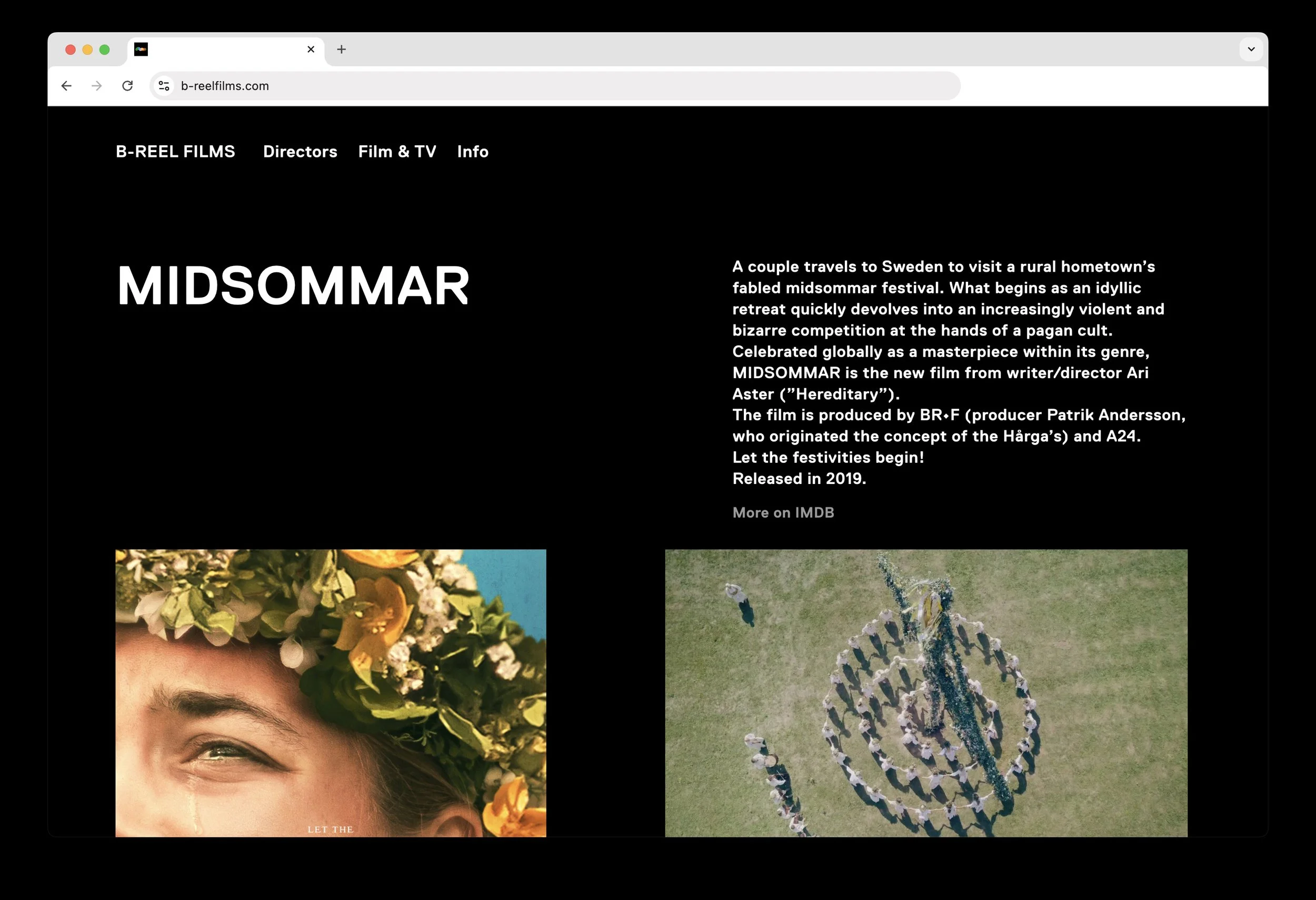
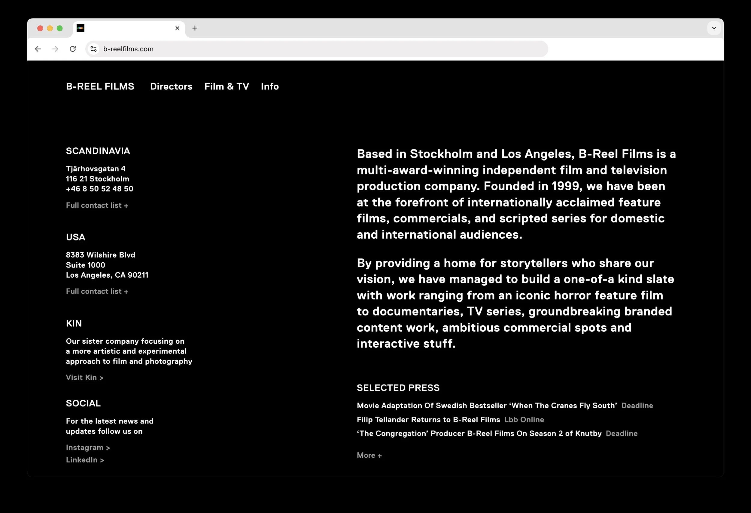
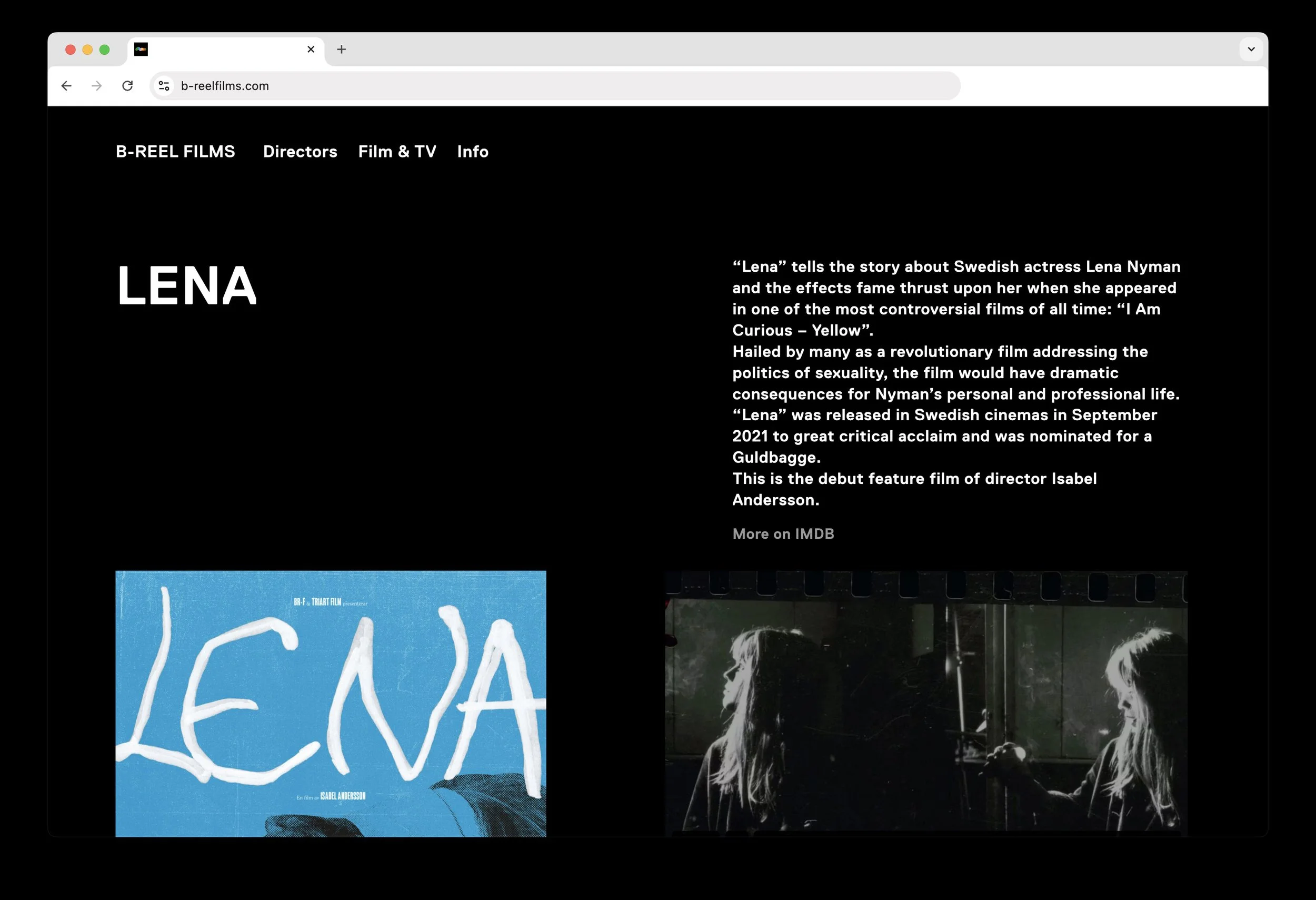
The reframing of B-Reel’s identity is a process of both visual reduction and reinvention.
Over time their visual toolbox had accumulated, bringing with it an overall lack of focus, intention and coherence. They needed a new perspective.
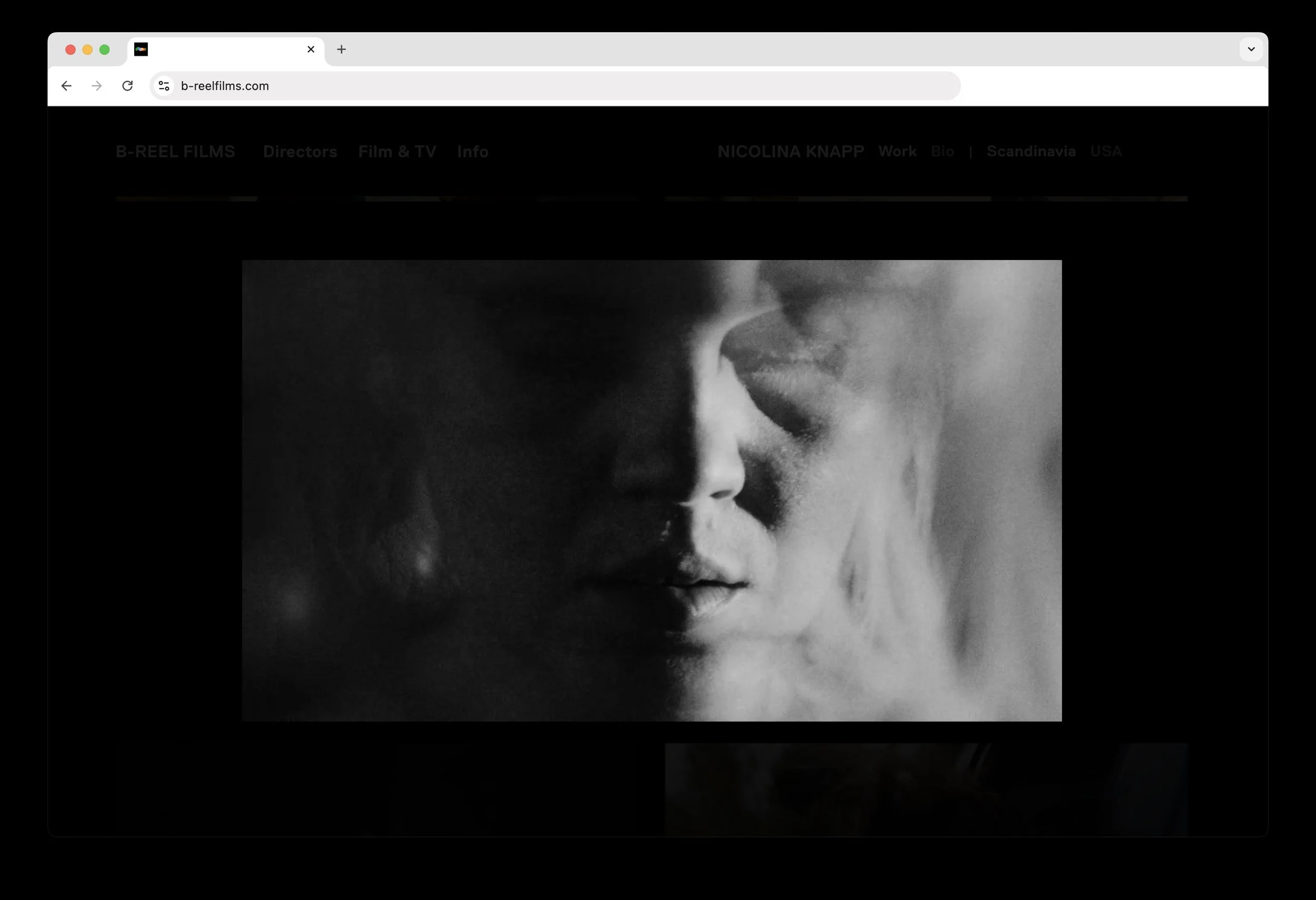
The concept we came down to is built on the complex and contrasting nature of film making, which B-Reel has operated in with great success since 1999. On one hand playfulness and entertainment; poetry in motion; a story’s windling road from start to finish. On the other hand professionalism, confidence, business and commercial ambitions. Their toolbox was reduced to a bare minimum, with one font kept for consistency and recognition, and a reporpused color palette. Presented in a new way that make sense to where the company is moving forward.
Brand Identity
Art Direction
Motion Ident
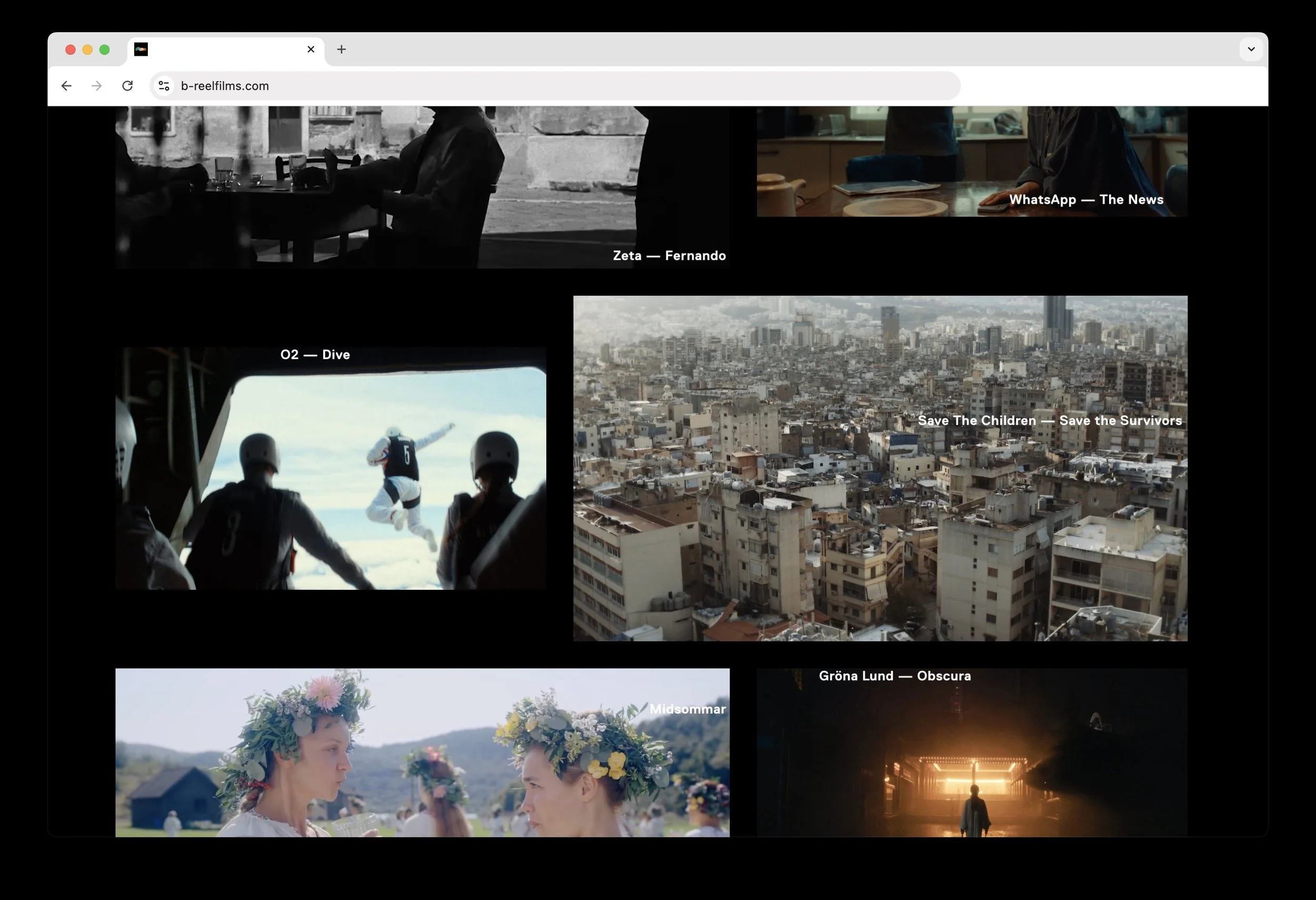
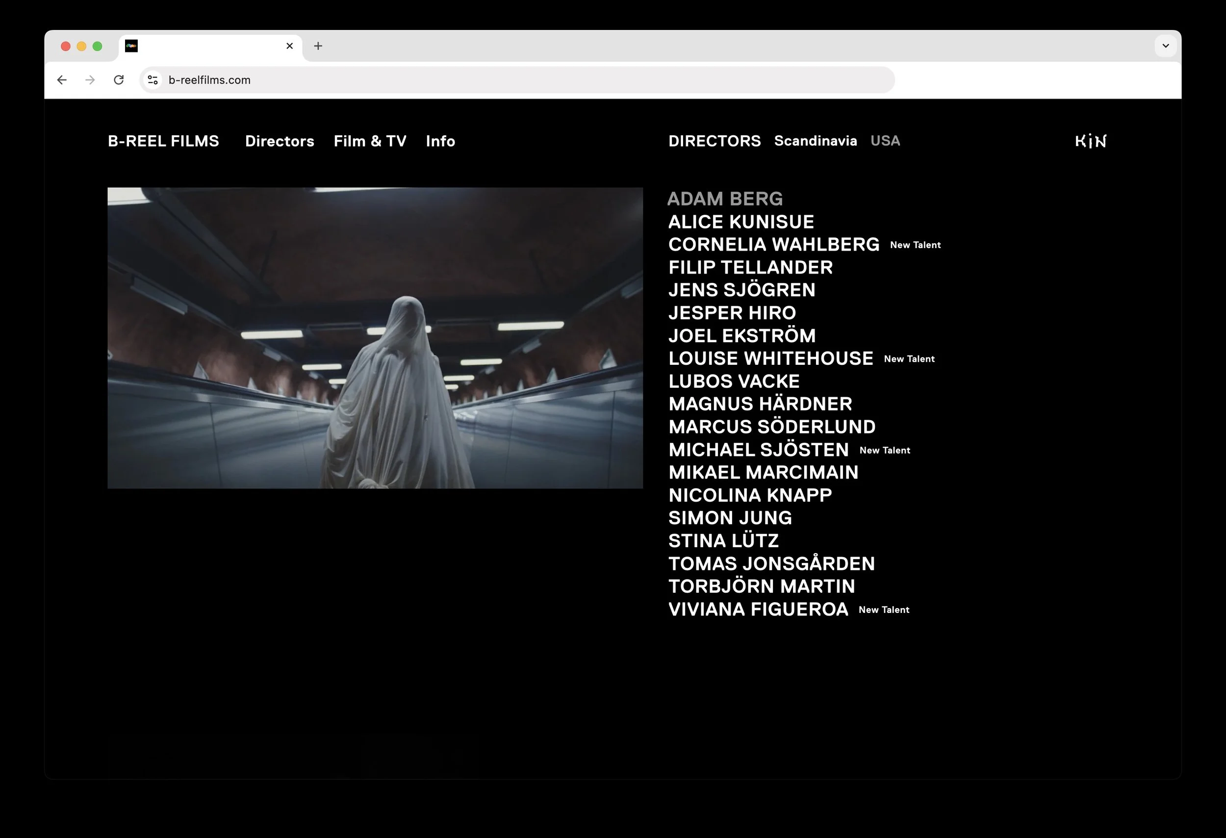
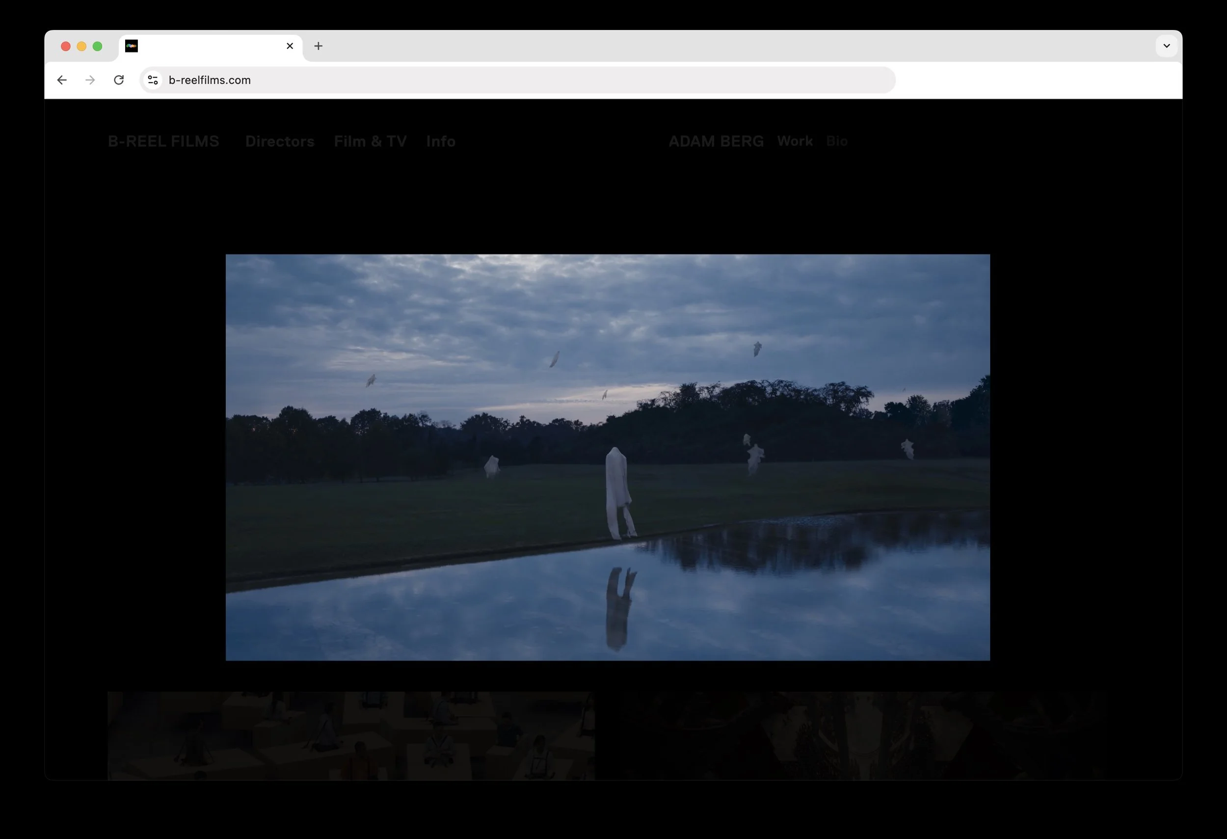
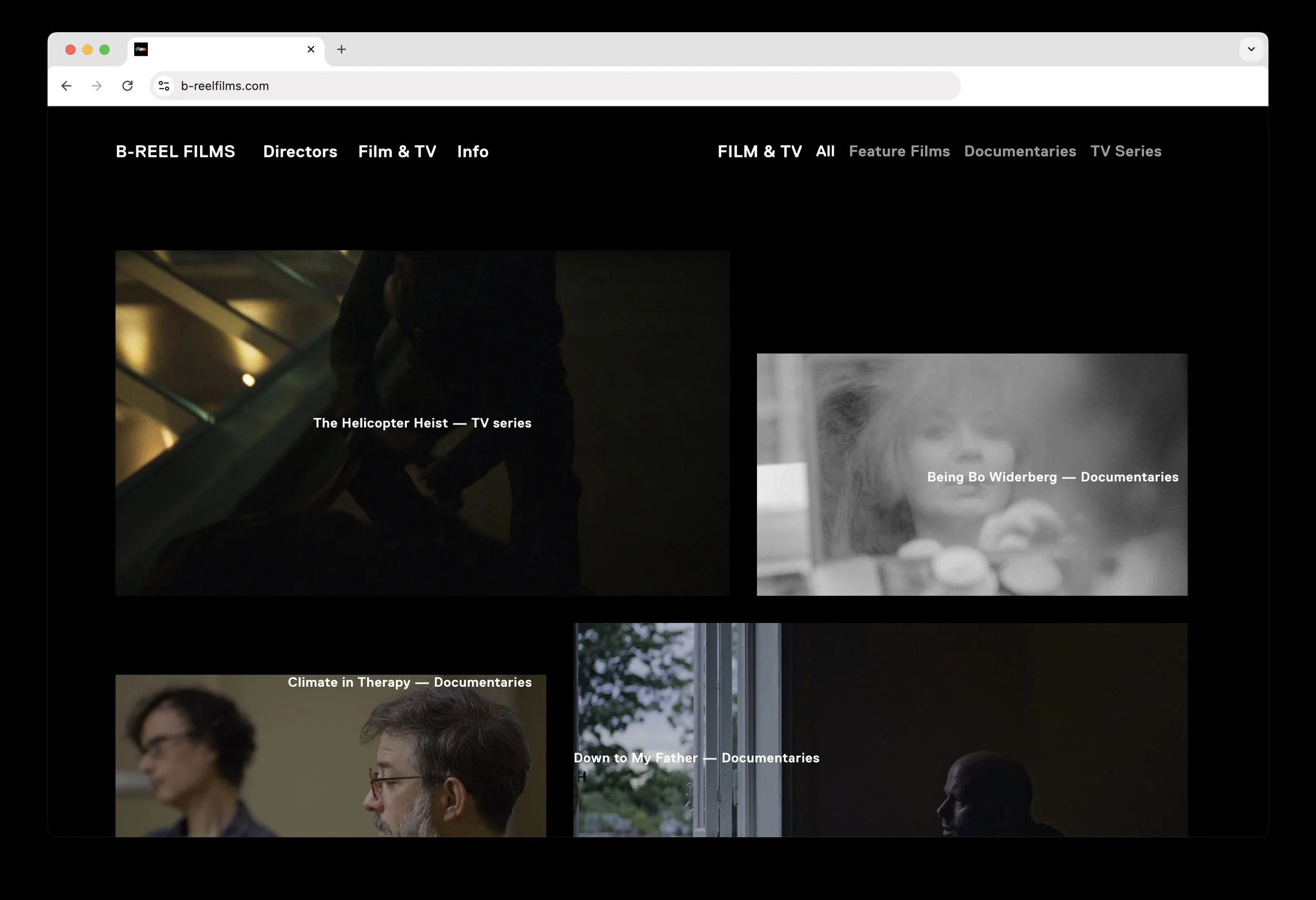
Online Presentation
Animation Untitled Services