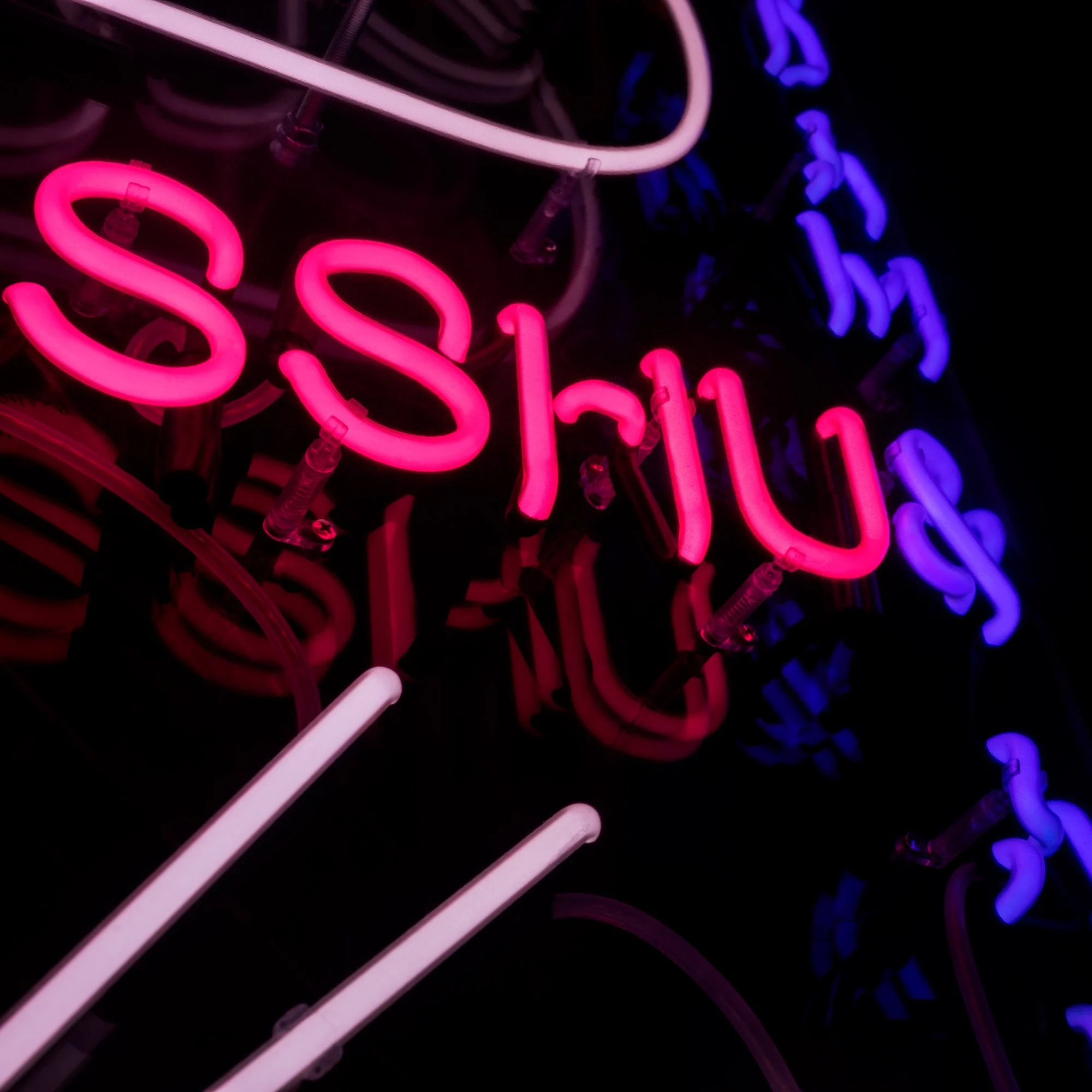
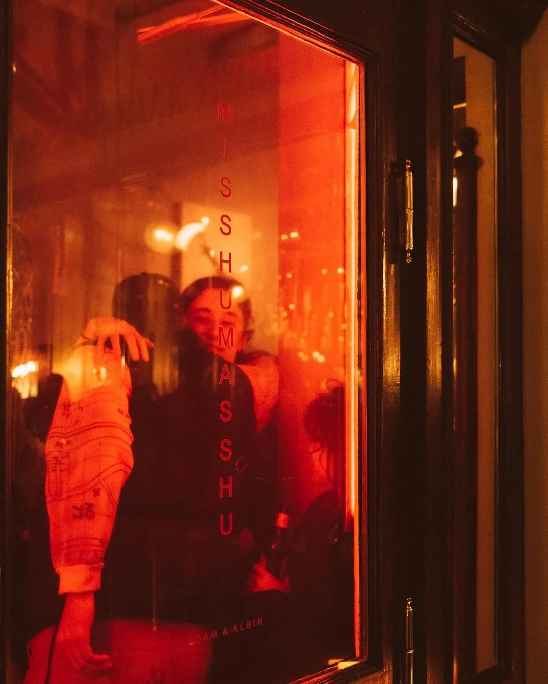
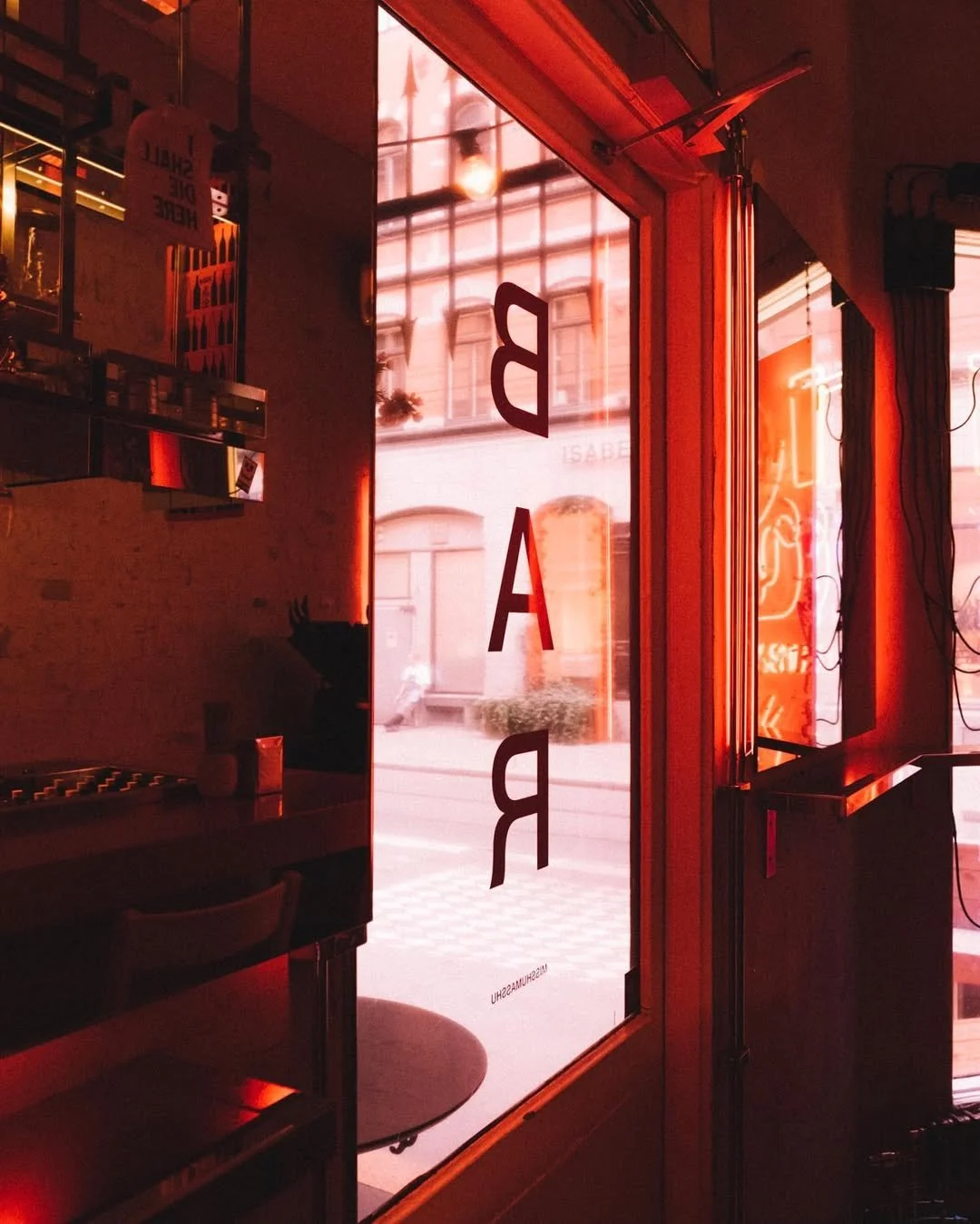

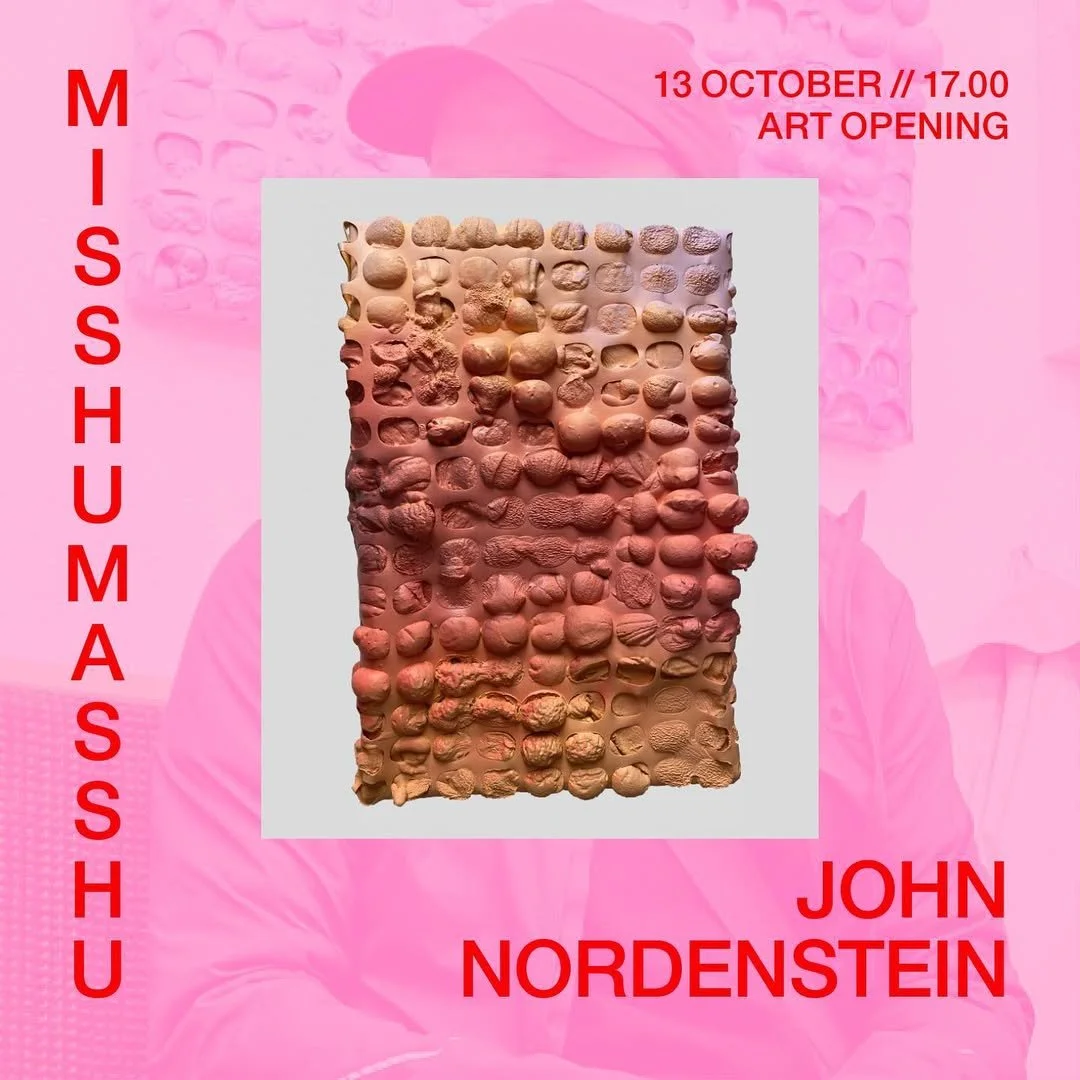
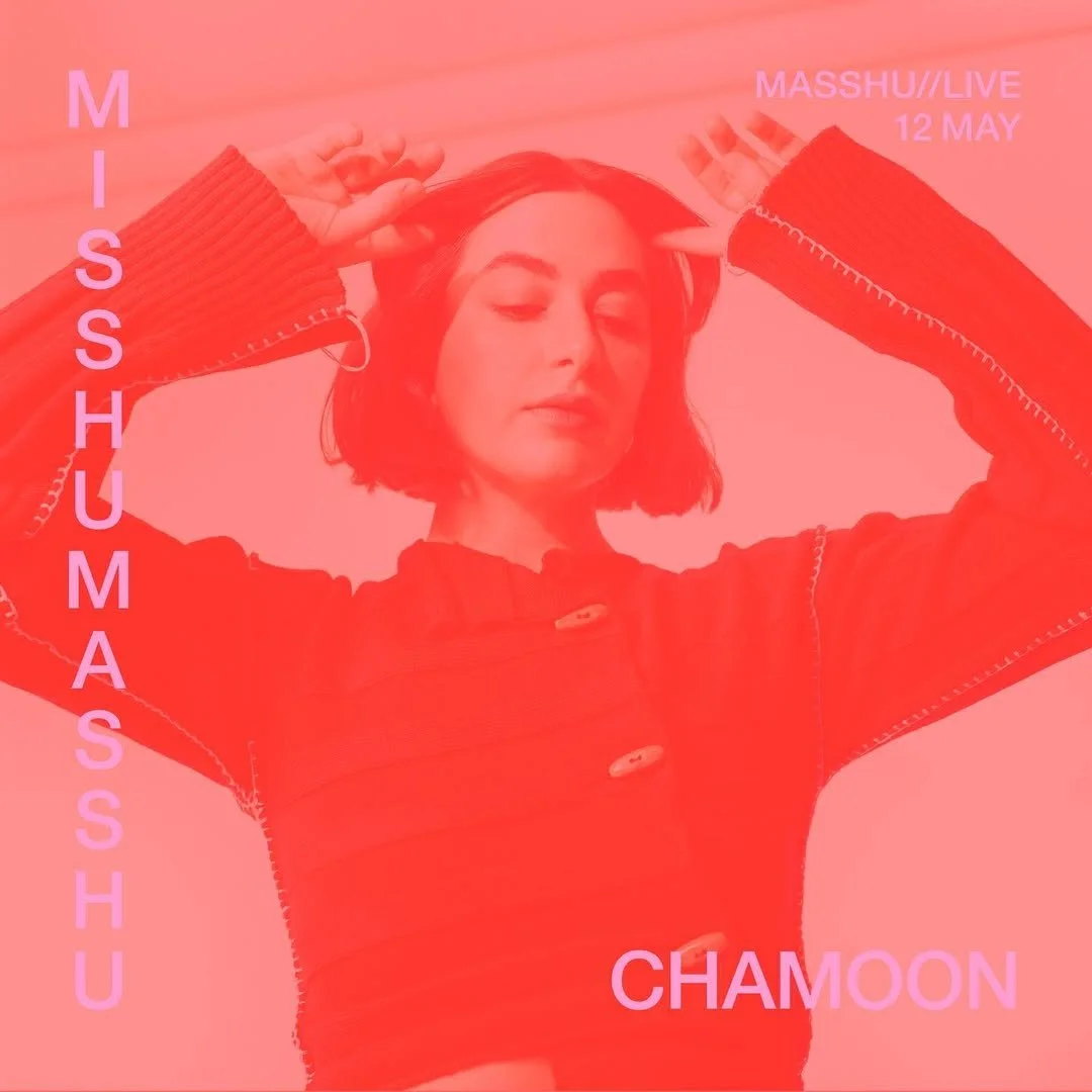


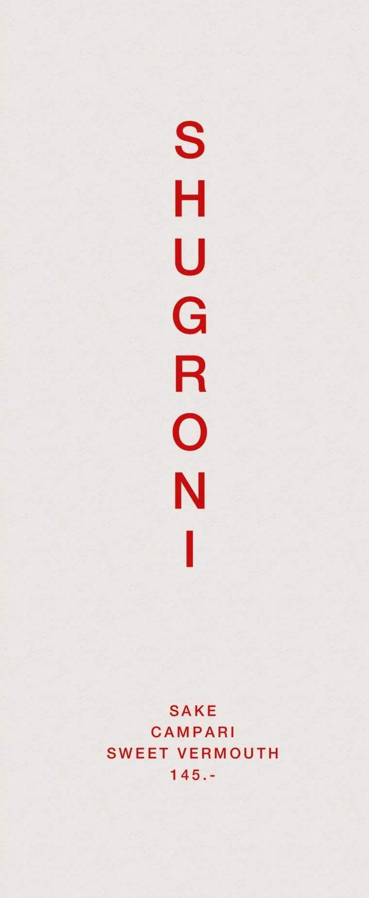
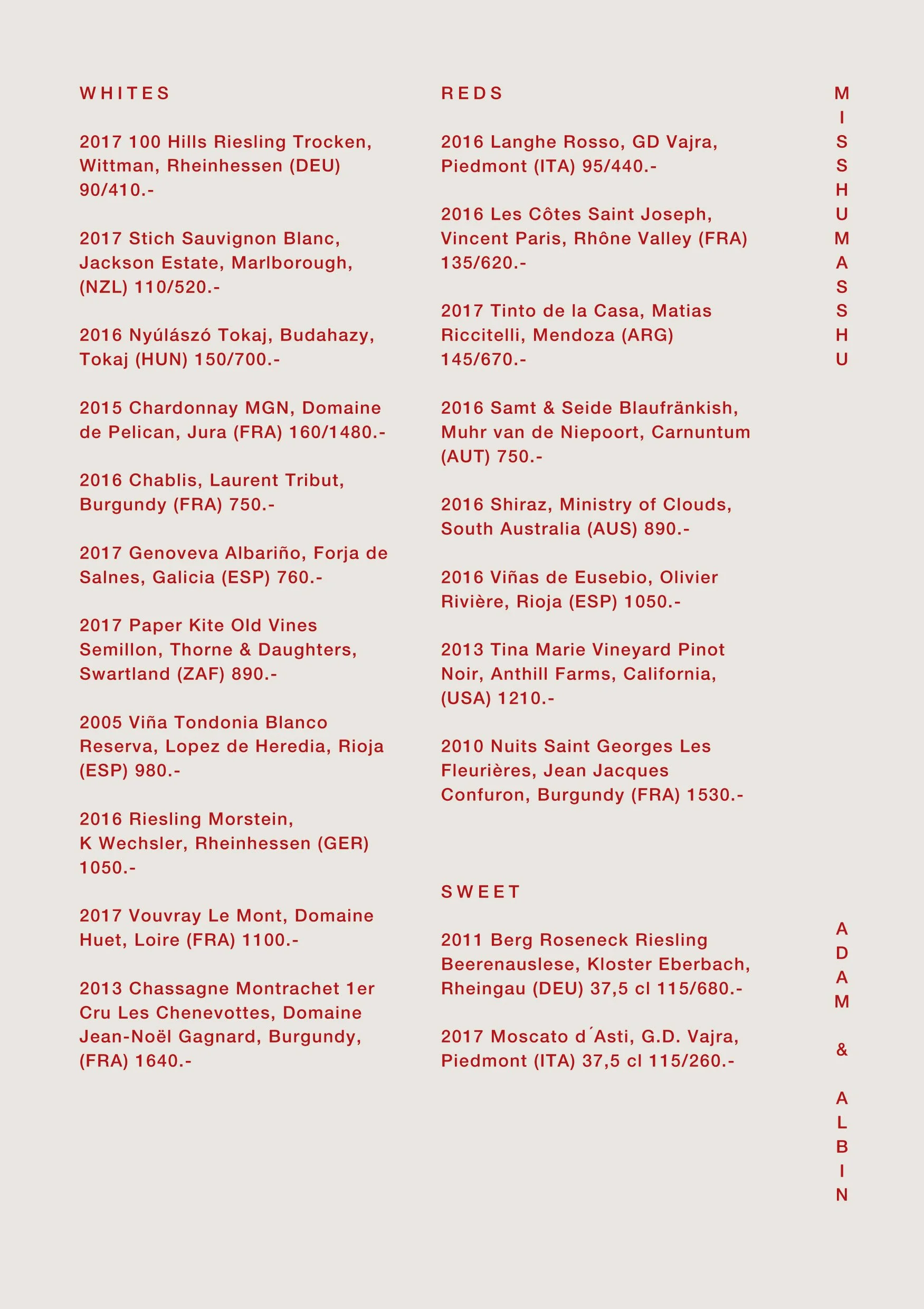
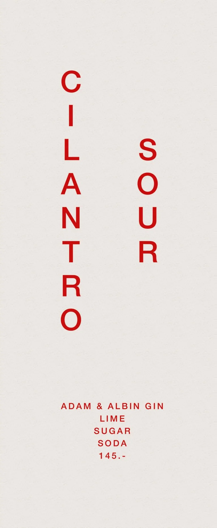
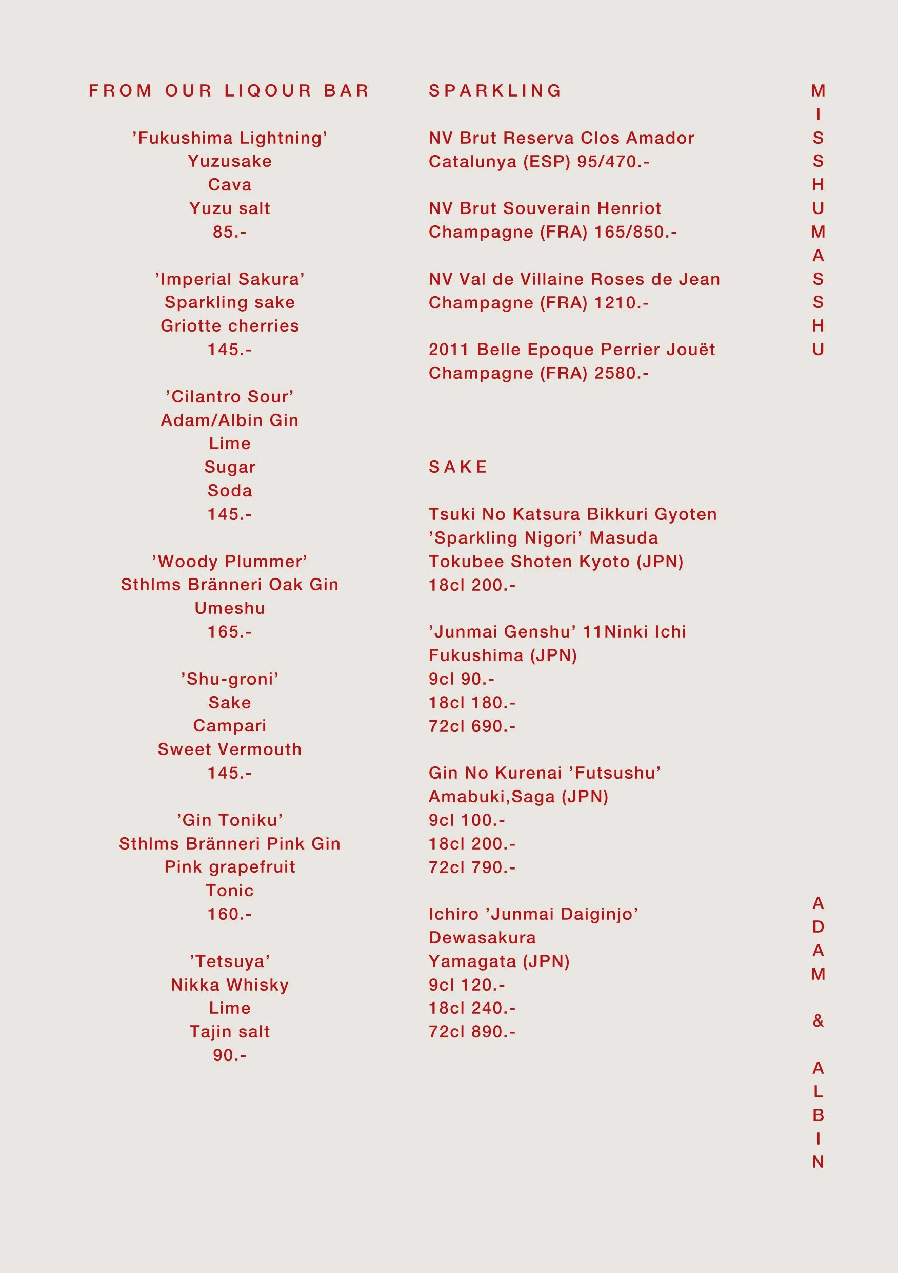
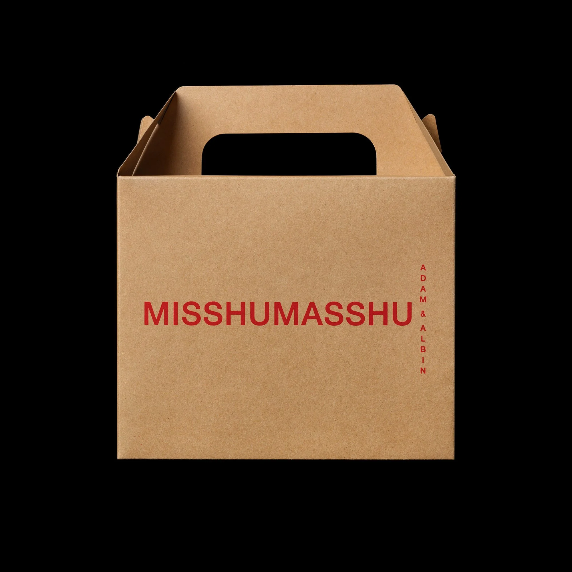
MISSHUMASSHU
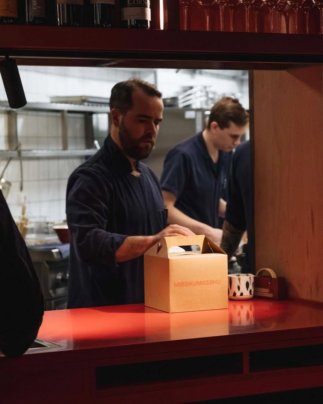
A contemporary izakaya. A playful mix of Tokyo, New York, and Stockholm. Noodles, ramen, sliders, sake, and shots. Remixed, blended, redefined.
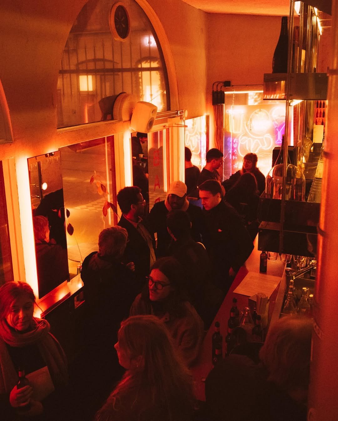
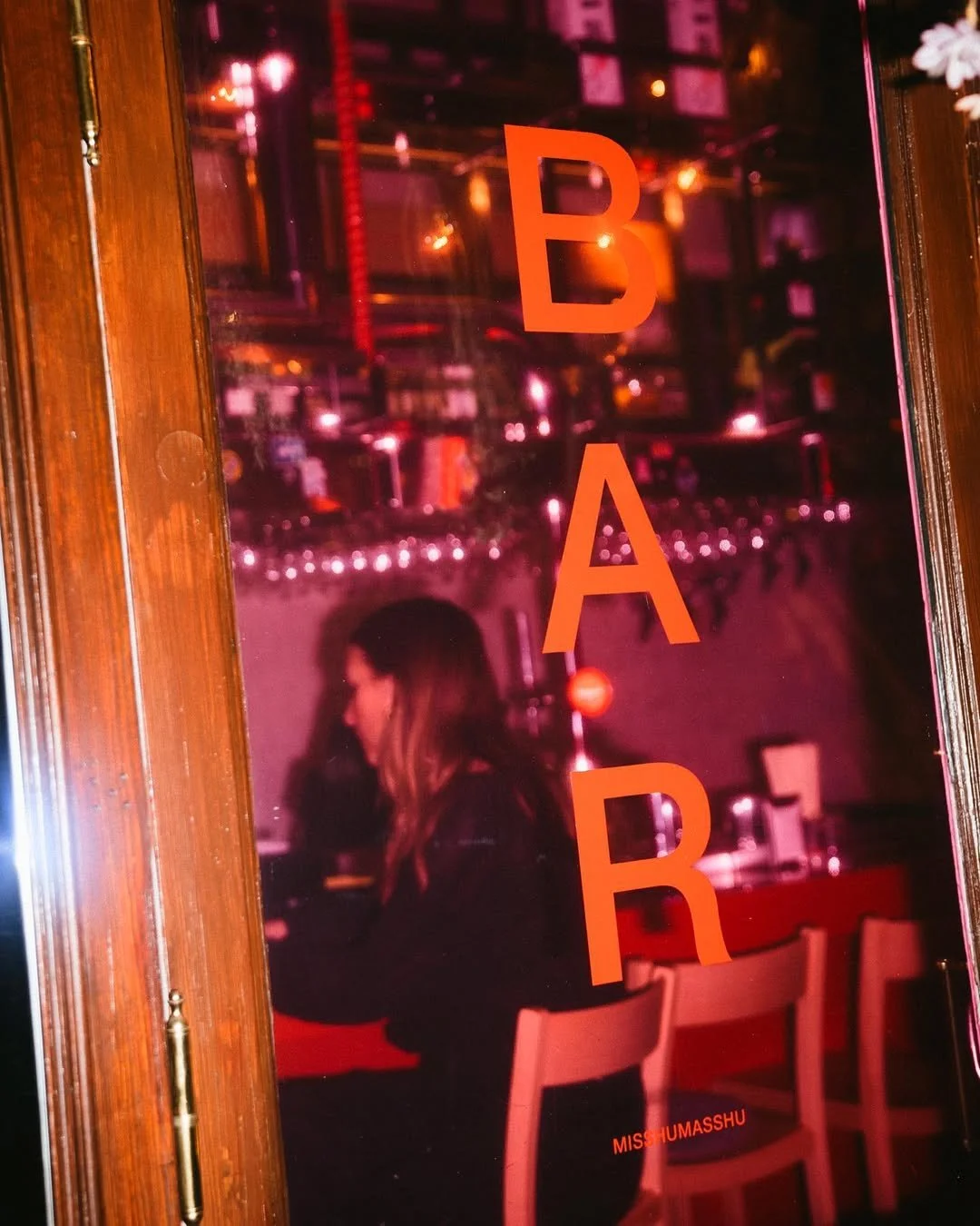
This was the starting point for restaurant Misshumasshu. Designed with a clash of cultures in mind, the identity embraces the mashup feel of the menu through the similarities and differences between dive bars and izakayas, injecting a new vibe into a neighborhood usually associated with more traditional Swedish dining experiences.
Brand identity
Naming
Artistic direction
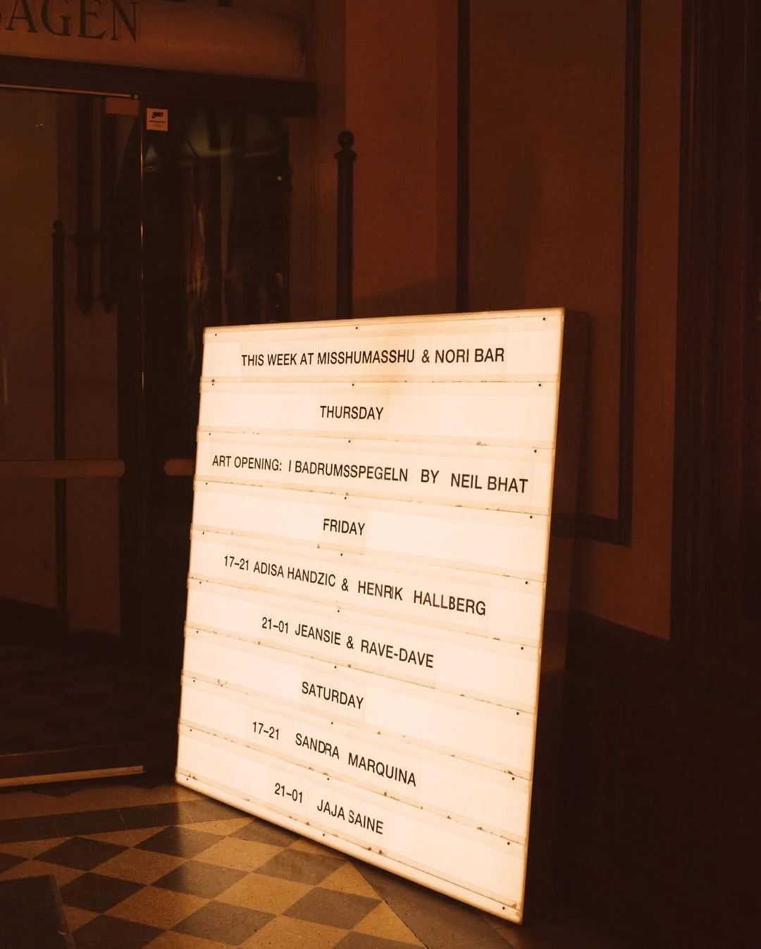
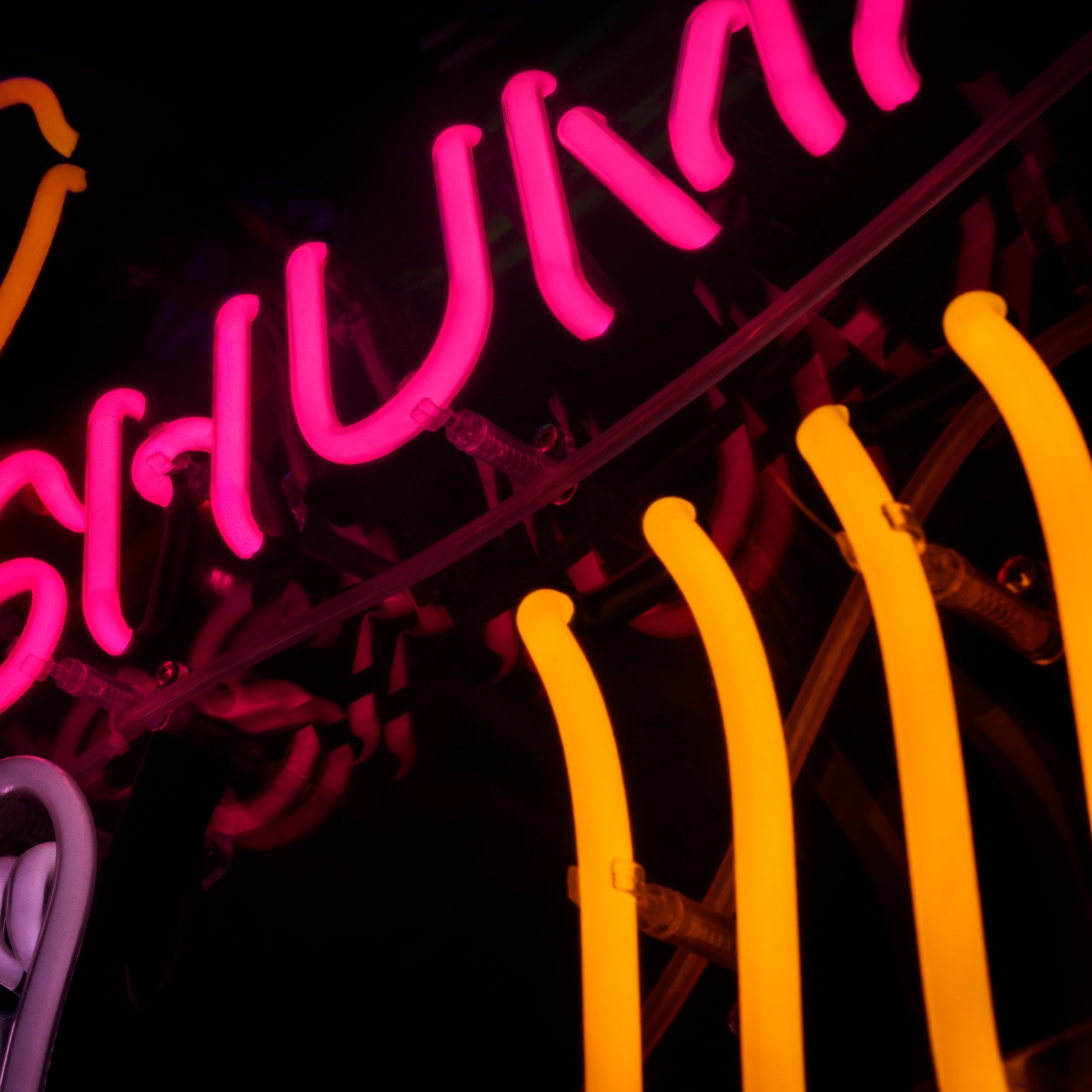
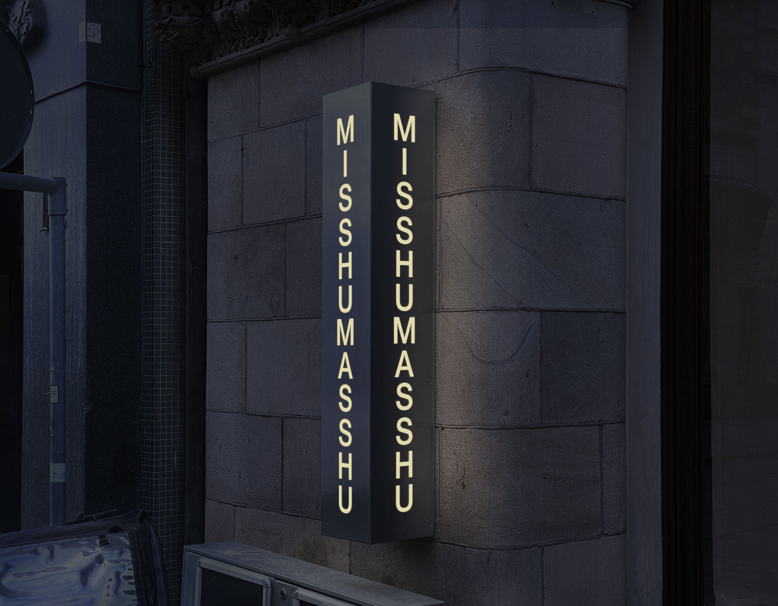
Signage
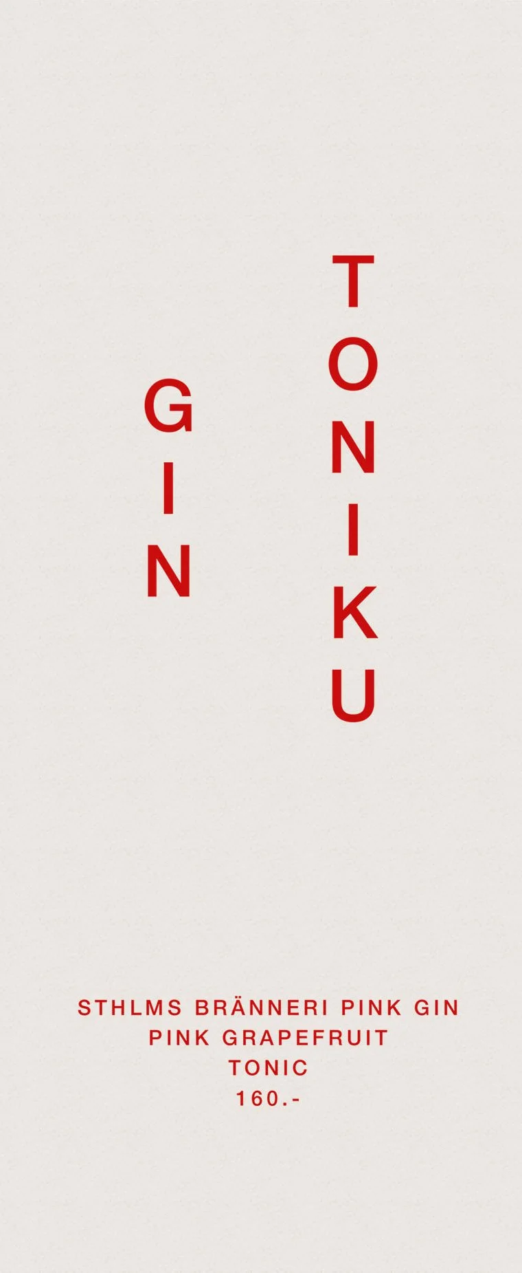
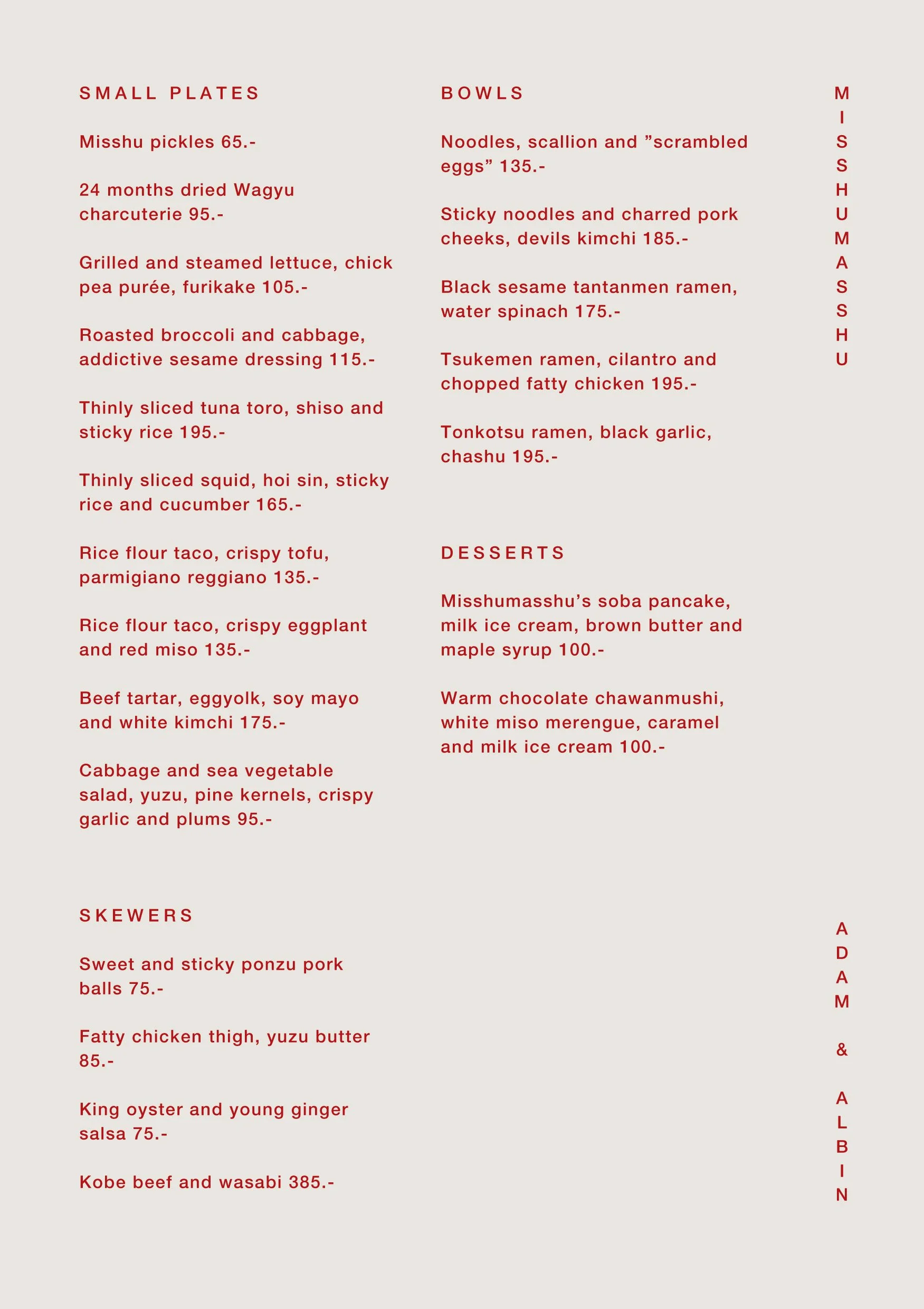
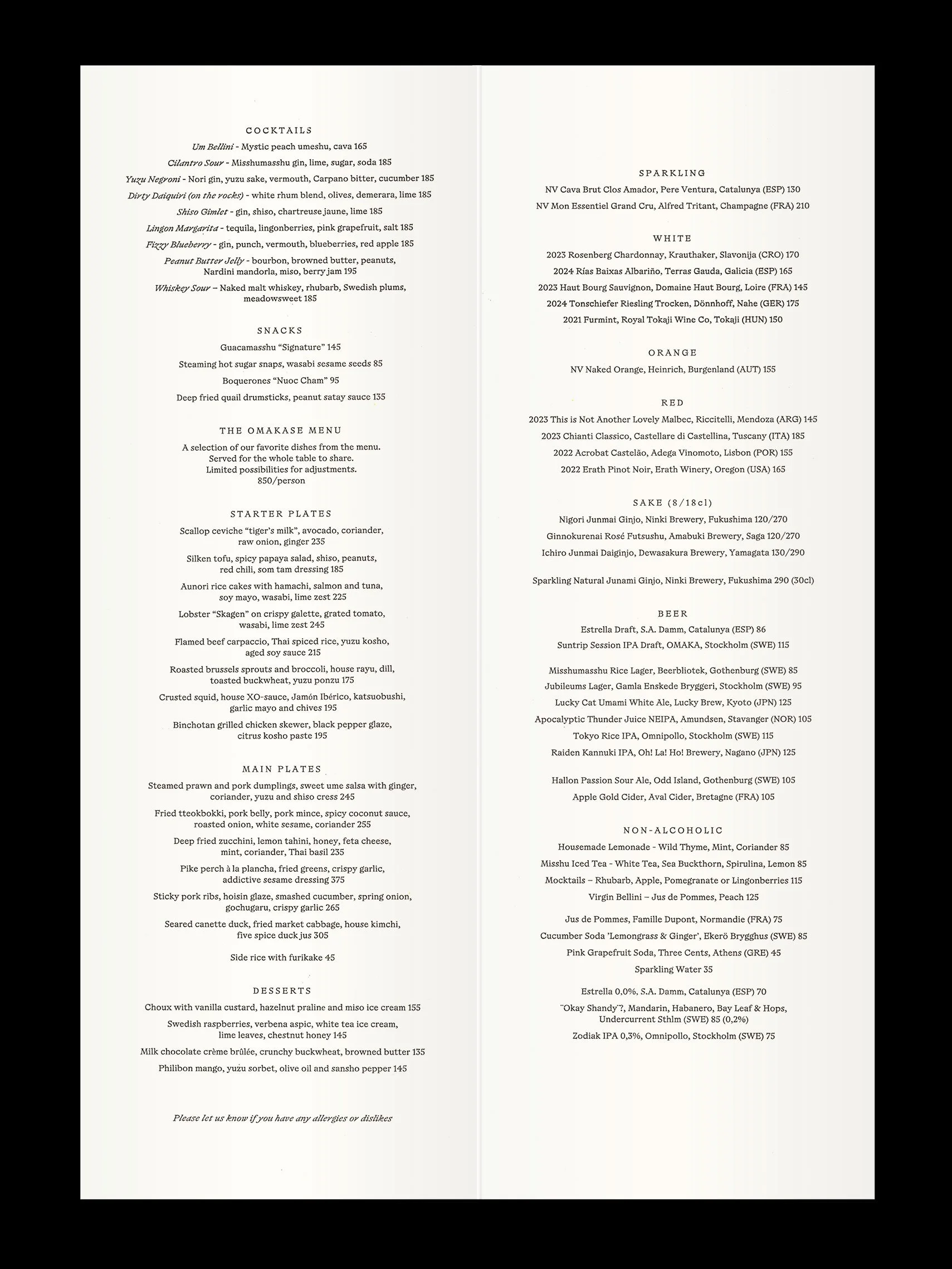
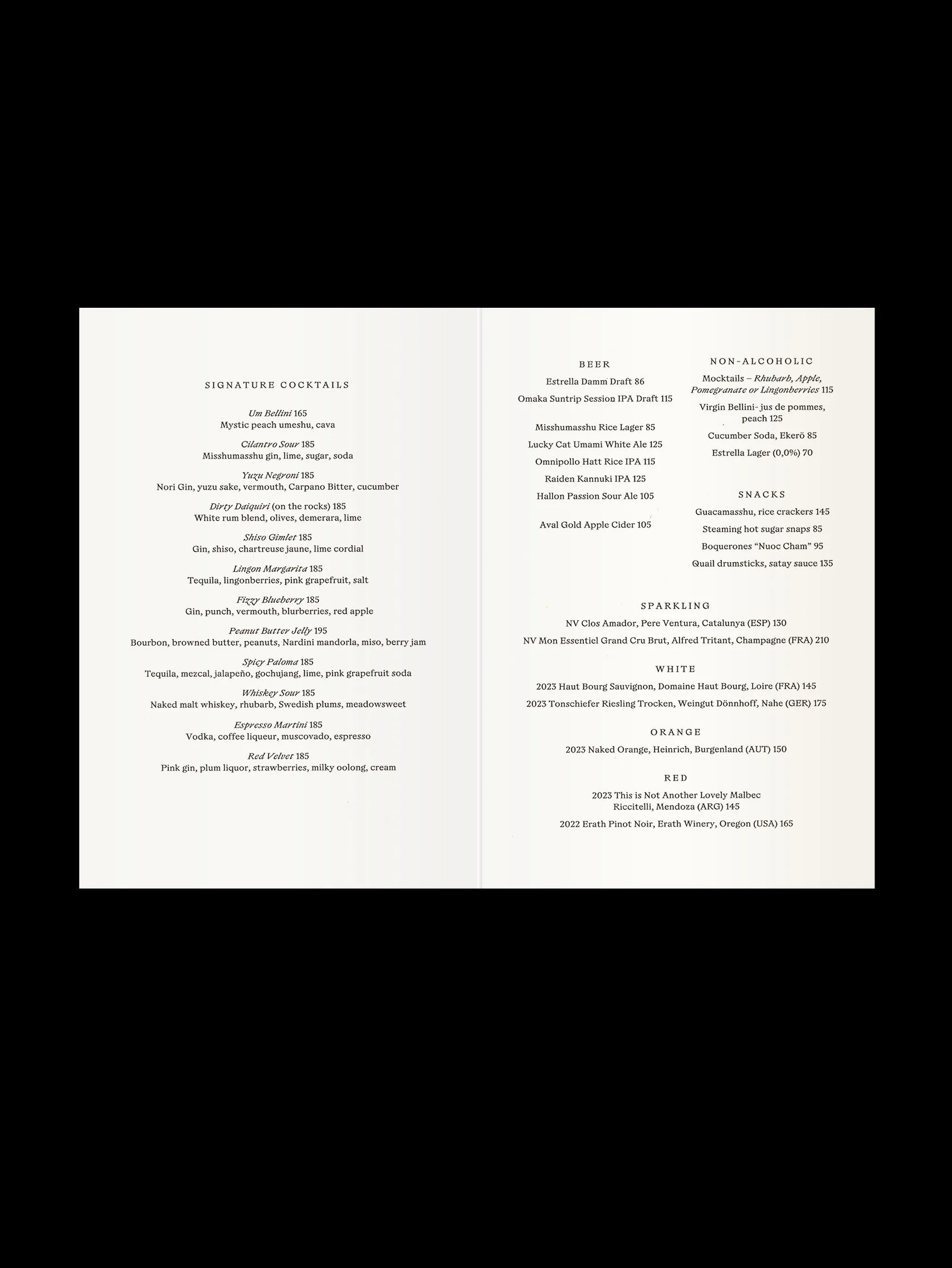
Menu design
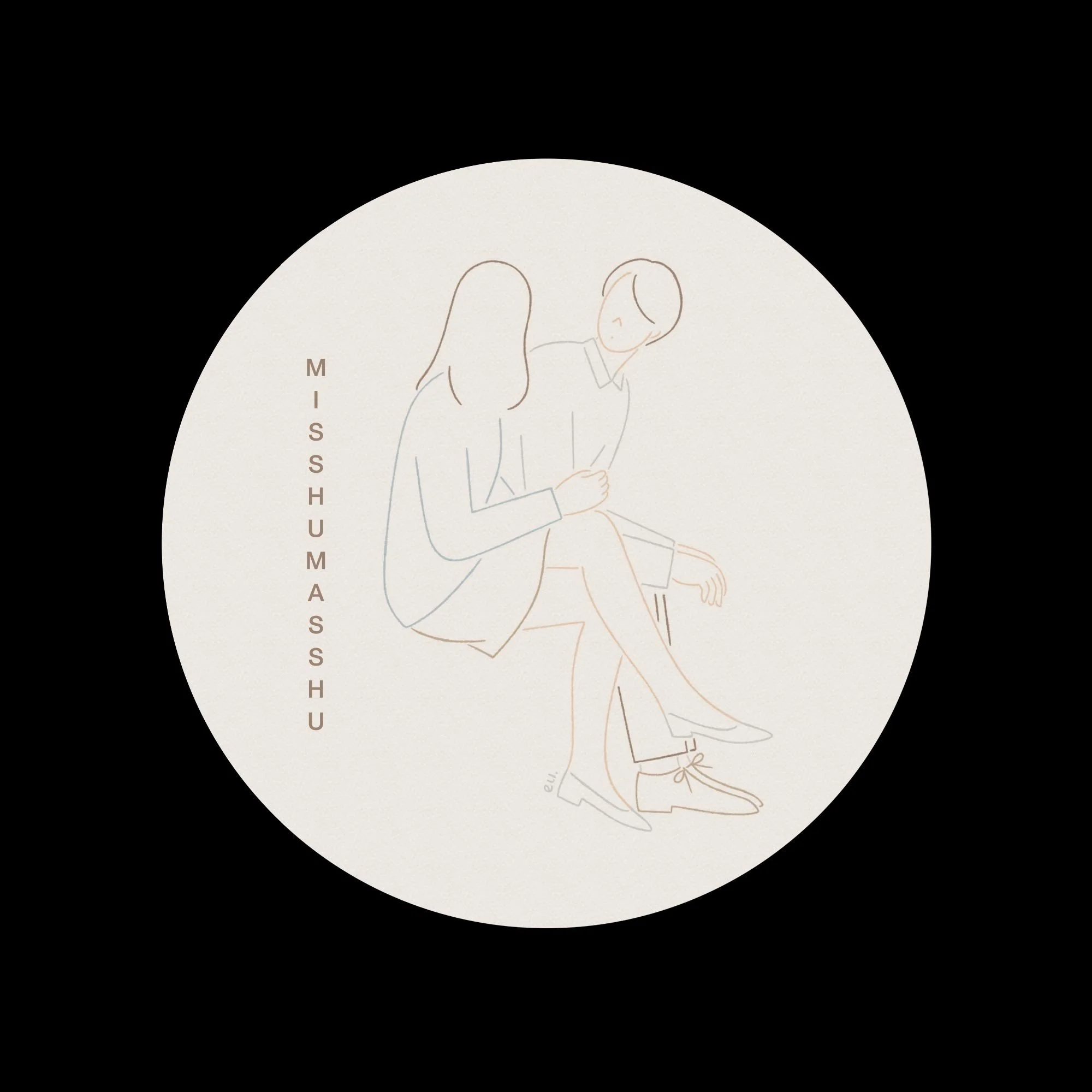
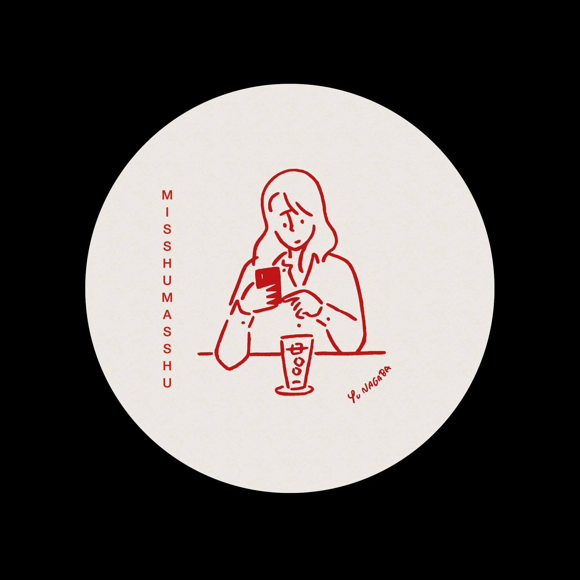
Coasters
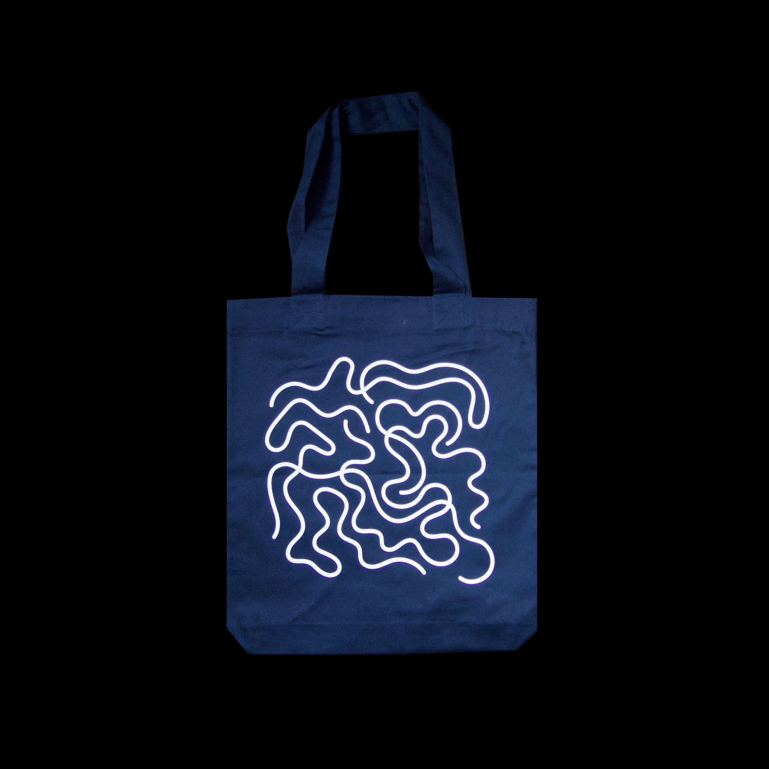
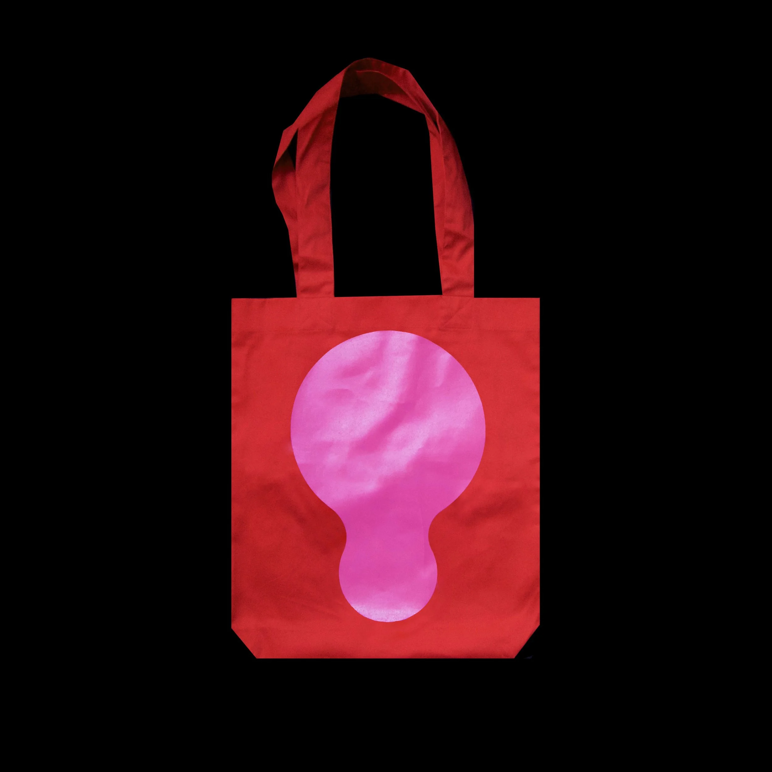
Merchandise
Social media templates
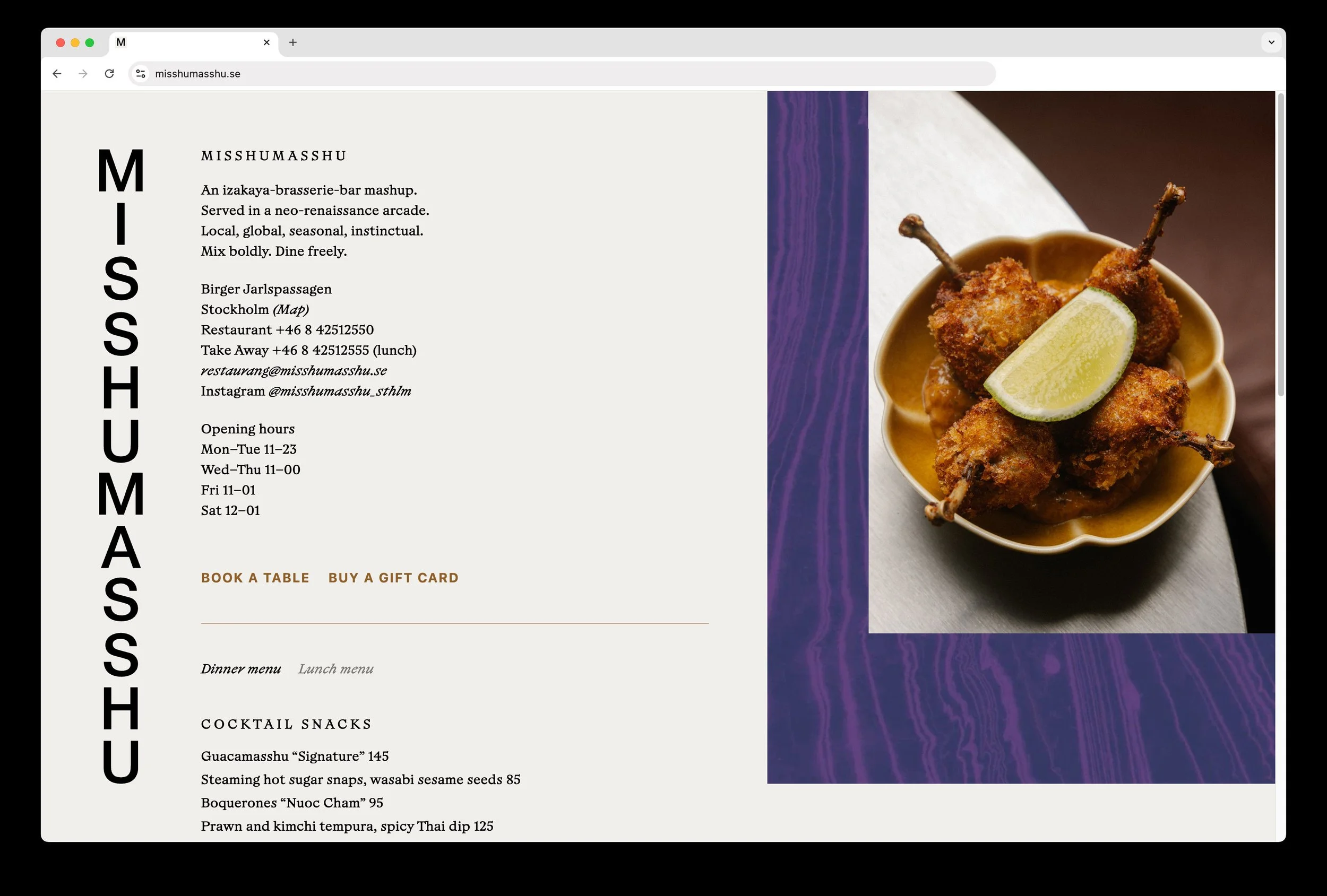
Online presentation
Credits
Photography Malin Fränberg, Patrik Lindell
Illustrations Emi Ueoka, Yu Nagaba and Daniel Carlsten
Copy Adam Springfeldt
Web development Simon Wallström
Interior design Specific Generic


MISSHUMASSHU
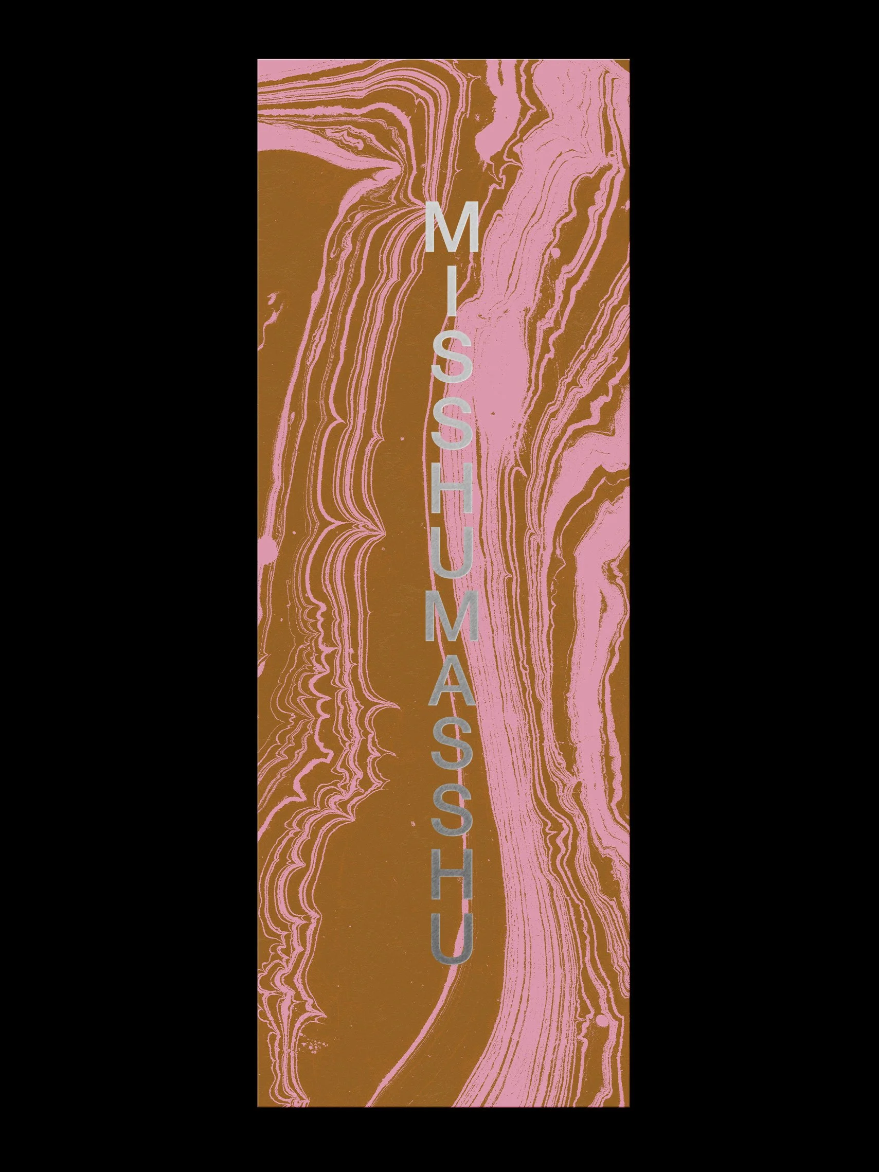
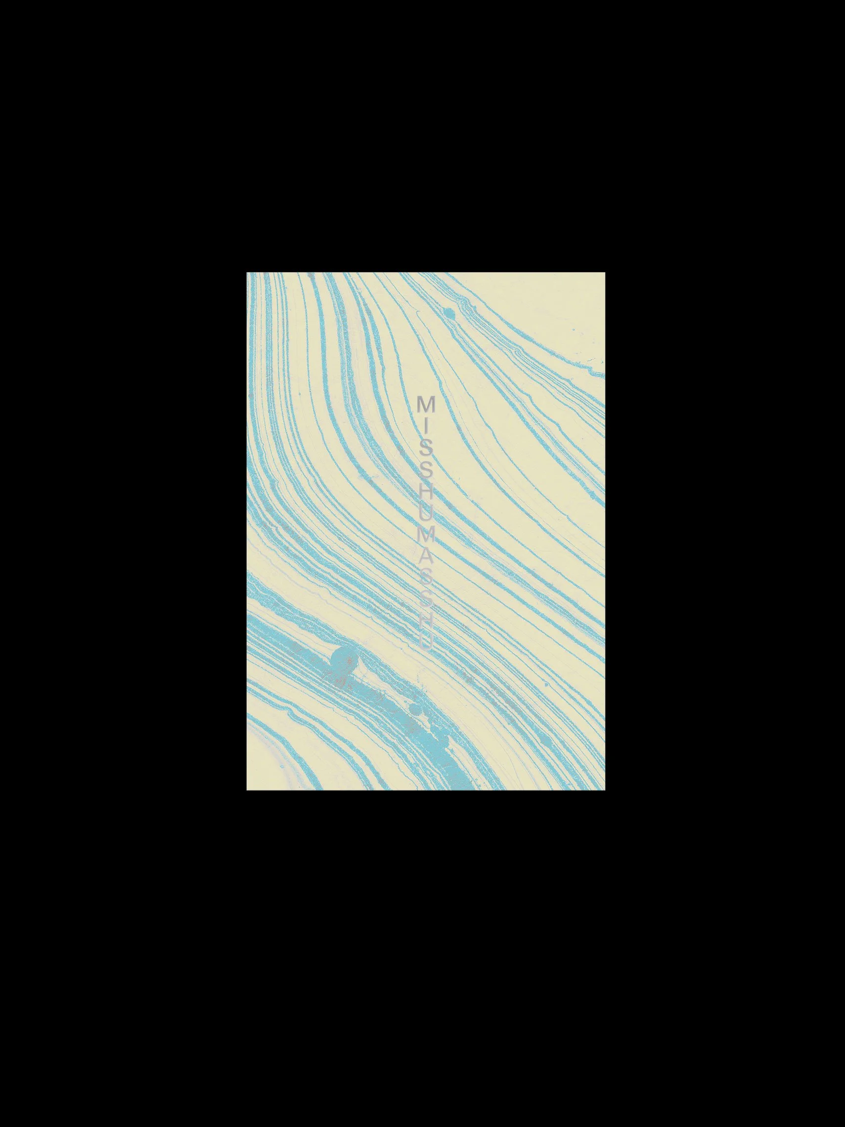
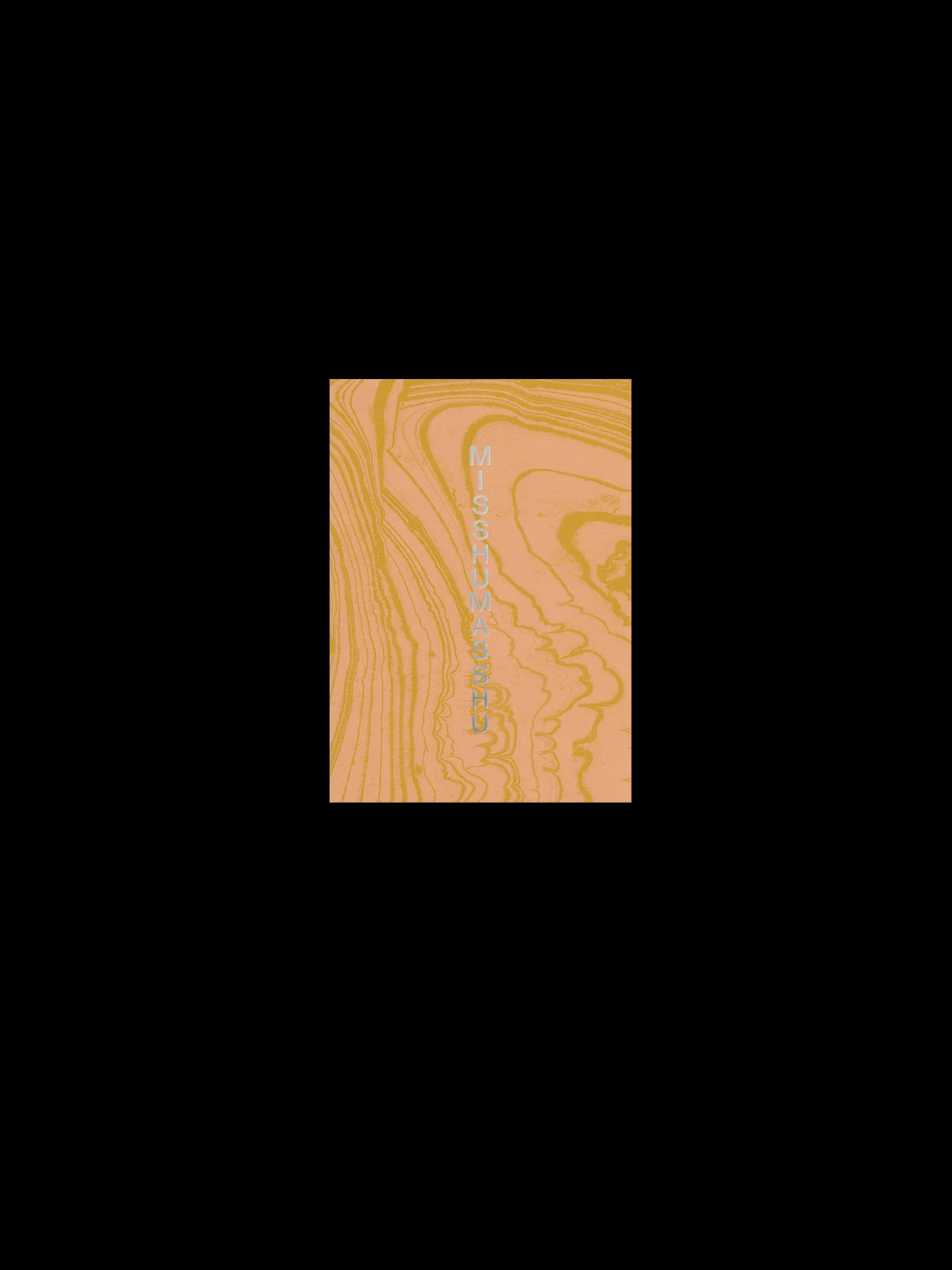
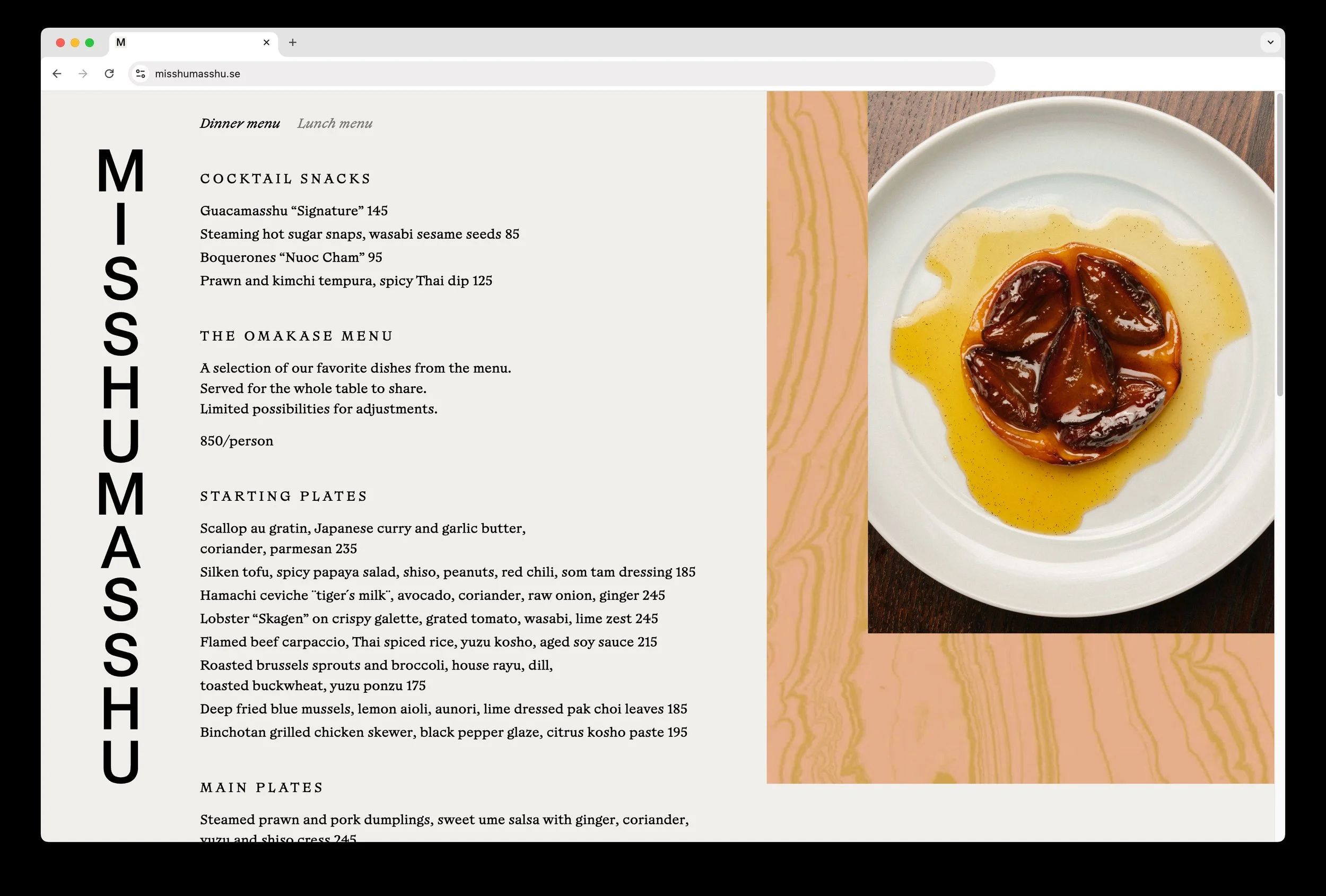
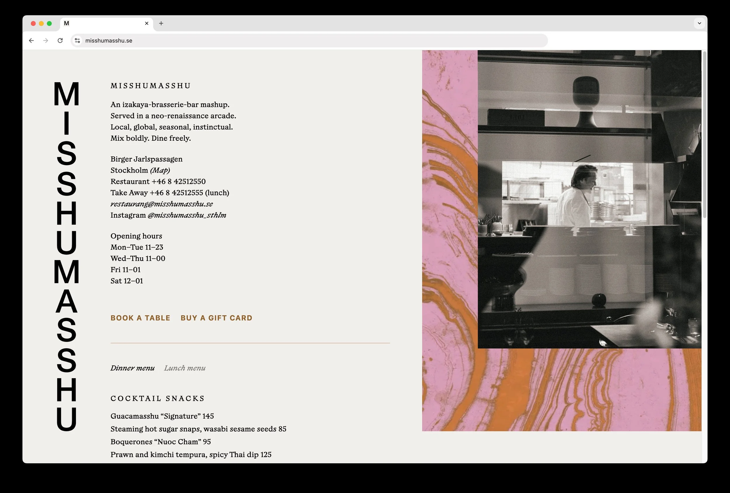
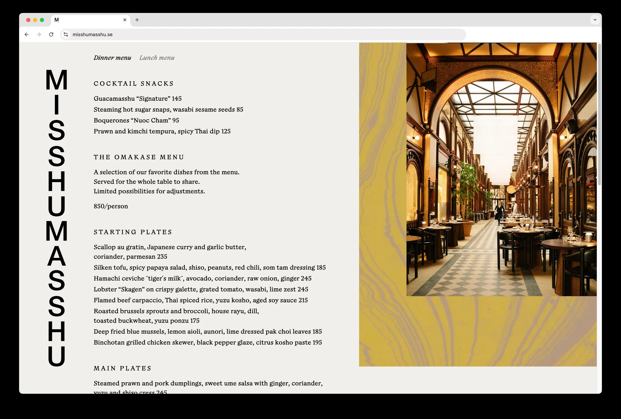
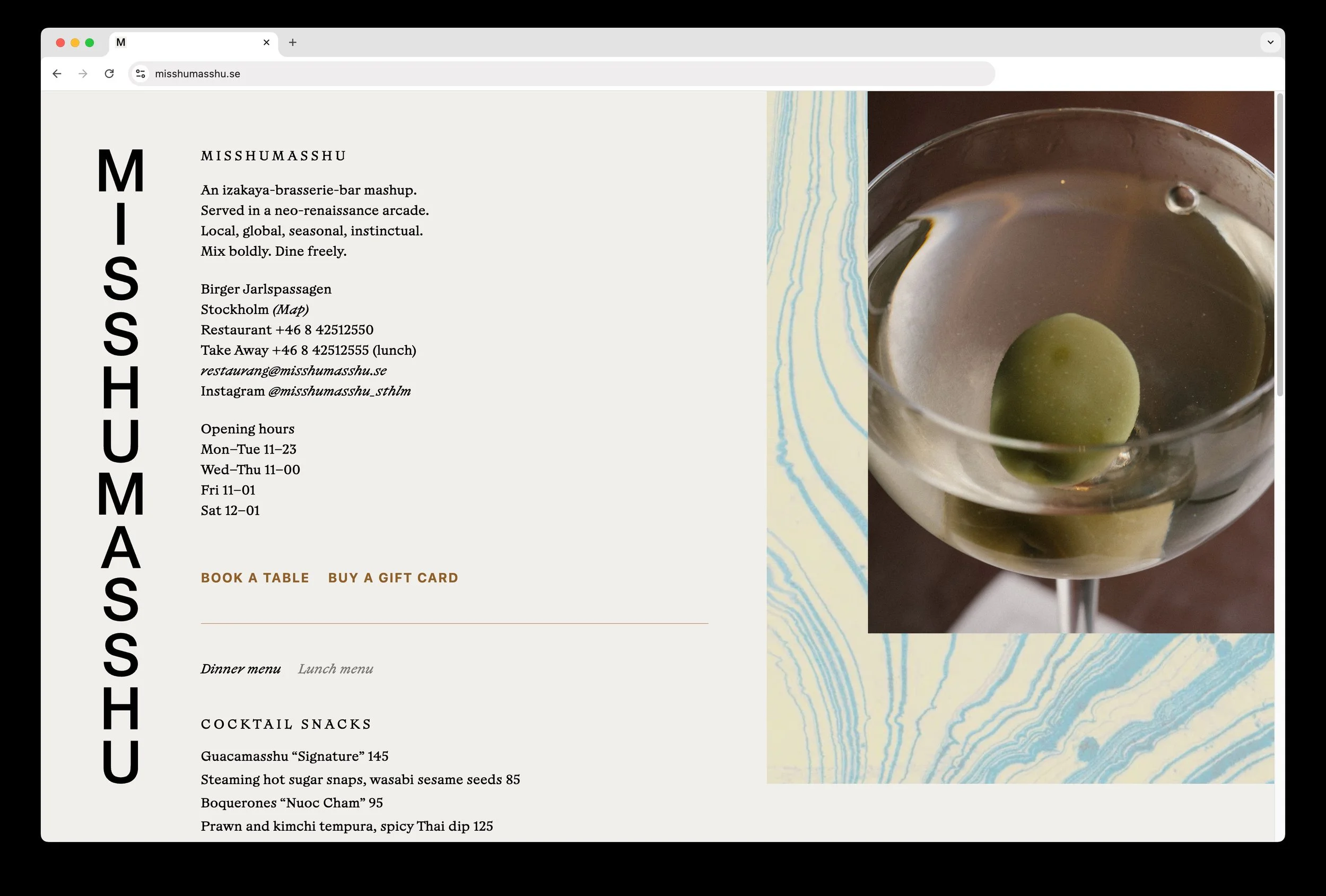
In 2024, Misshumasshu closed for renovation, and reopened the following year with a larger, elevated, more mature interior design and a menu referencing a wider Asian palette than earlier. Hence, the identity was revamped to reflect this transformation. Focusing less on literal geographic cultural connotations (Tokyo, New York, etc.) than before, the new identity interprets a more general idea of a blend, most visible through a series of hand made marbled artworks used throughout menus and online presentation. The vertical logotype remained for consistency, and a new typeface was introduced to enhance the new, more upscale feel.
Credits
Photography Malin Fränberg, Patrik Lindell
Copy Adam Springfeldt
Web development Simon Wallström
Interior design Maja Bernvill